5. Ice in the Arctic
The false colour of the sea ice highlights the fissures in blue and consolidated sea ice in white.
Source: NASA
Time series - Arctic sea ice extent (2/3)
Overview of the Arctic
Satellite images provide a powerful tool to look at the geographical area covered by sea ice. The repeat coverage we get with satellite instruments means that we can investigate the way sea ice changes with season and from year to year.
We've already seen some of the different types of satellite data that can be used. For more details go to supplement 3
Passive microwave sensors provide daily coverage of the Arctic. We can look at the detail of changes from day to day.
Other sensors such as those operating in the visible spectrum are restricted by cloud cover, but can give better spatial resolution. The finer detail in these images can help in understanding the way pack ice behaves as it breaks up.
The animation on the right shows sea-ice from January 1, 2007 through the minimum extent which occurred on September 14, 2007, as measured by the AMSR-E passive microwave sensor on the NASA Aqua satellite.
The colours relate to brightness temperature (which is in turn related to the temperature of the ice). Cold brightness temperatures, shown in brighter white, represent consolidated sea ice. Warm brightness temperatures (in blue) highlight the fissures or divergence areas in the sea ice cover.
The resolution of the data used is 6.25 km. The sea ice edge is defined by the 15% ice concentration contour also obtained from AMSR-E data. This ice concentration is derived from data with 12.5 km spatial resolution.
Thirty year time series
Thirty years of passive microwave imagery are available from the SSM/I series of sensors. Whilst the resolution of these data, 25 km, is not as good as AMSR-E, the fact that we have such a long time series of daily imagery means we have a powerful tool for looking at changes in sea ice cover.
The plot on the previous page of total ice cover for each year shows the variability from year to year as well as the trend. But even if the total area covered stays the same, it may be that some locations have more or less ice than others for that year. For example, ice cover depends on the temperature of the water which is not just affected by how much sunlight is absorbed. Local changes in the wind or ocean currents can mean changes in how much ice is formed in a particular area: growth in one area may be balanced by melt in another.
Scientists studying the Arctic ice cover use computer models which include these effects. Satellite imagery can be compared with the model output to help improve the models so we can have better ways of predicting future ice cover.
Even when the total ice cover is decreasing, local regions may have more ice than usual. Satellite imagery gives us the overall picture.
Summer melt
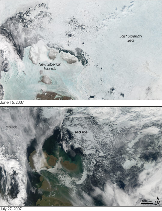
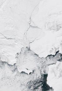
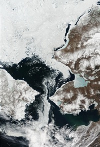
Pairs of images from the visible wavelength sensor MODIS show just how much sea ice has melted in a month or so. The examples show just two areas in the Arctic, the Bering Sea and the East Siberian Sea. The MODIS sensor has a spatial resolution of 500m for looking at sea ice.
Visible imagery gives us better spatial resolution, but requires cloud-free conditions.

Source: NASA
Sea ice has a higher albedo than the surrounding ocean, which makes it easy to detect from visible remote sensing instruments. The better spatial resolution means that smaller gaps in the ice can be detected.
We'll look at interannual changes in sea ice on the next page.


