4. Vegetation Phenology
Time series of vegetation phenology (cont.)
As you have just seen the two phenologies for Tougere Koumbe are a close fit, this is not the case for Bobo Dioulasso. The Coefficient of Determination is low at 0.764291 and the gain is also low at 0.852847. (See the table on the previous page for more detail.)
This suggests that while the type of vegetative cover at Tougere Koumbe has not changed from 1982 to 1999, the data for Bobo Dioulasso suggests that the cover here has changed.
We can verify this by plotting the phenology of one location against the phenology of the other:
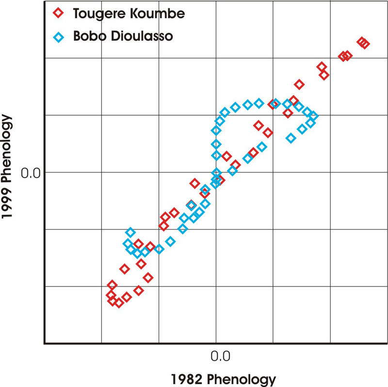
Regression curves of phenology data in 1982 vs. 1999 for Toguere Koumbe and Bobo Dioulasso.
As you can see the shapes of the curves is quite different. By plotting the start phenology against the end phenology we can see how much they vary, this helps us to visually explain the values that were been derived in the table on the previous page. In this case a straighter line indicates less variation in the data.
Does this information help us to determine whether the vegetation phenology has changed over a period of time?
In short, yes, it does.
The plot illustrates that the phenology of a region can change from year to year. Different types of vegetation have different phenological profiles as plants of diffrent species or in diffrent locations may grow at different rates throughout the year.
An increase vegetative cover and mass is primarily limited by the major constraints to growth; e.g. water availability. The actual constraints that apply will vary from place to place.
2) Are they the same factors?
Different factors are the major constraint at different geographical locations; in the Sahel (this region of Africa) a lack of moisture is the most common constraint to growth.
Analysing the time series
- Download the time series for Kotobi, Bobo Dioulasso, Toguere Koumbe and Hodh och Chargui and enter the data on four separate worksheets in one spreadsheet.
- For each time series, derive average annual values, remembering that there are 36 values per year in the datasets.
- Use the average values to derive a linear fit to the data. Subtract this trend from its data set.
- Now plot the phenologies for the first and last years in the time series; you should get graphs like those shown on the last page for Bobo Dioulasso and Toguere Koumbe.
- Plot the first phenology against the last phenology and then do a linear regression between them.
The gain and offset from this regression, and the Coefficient of Determination are three of the four Phenological Change Indices that can be derived from image time series data.
