Atmospheric Carbon Dioxide and Global Temperature
Increasing carbon dioxide (CO2) concentrations in the atmosphere have led to rising temperatures on earth. This climate change is undoubtedly induced by man-made (so-called anthropogeneous) emissions of greenhouse gases: they alter the balance of incoming visible solar radiation versus outgoing radiation in the infrared that is increasingly absorbed in the atmosphere.
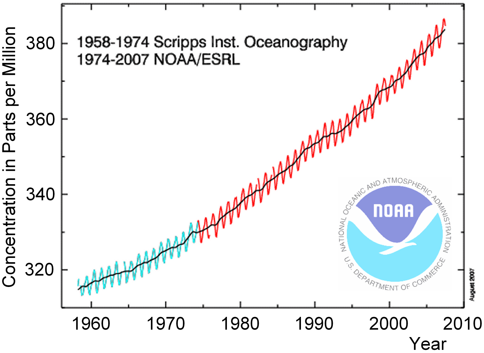
Monthly averaged atmospheric carbon dioxide concentrations (green and red curves) and moving average (black line)
measured from 1960 to 2007.
|
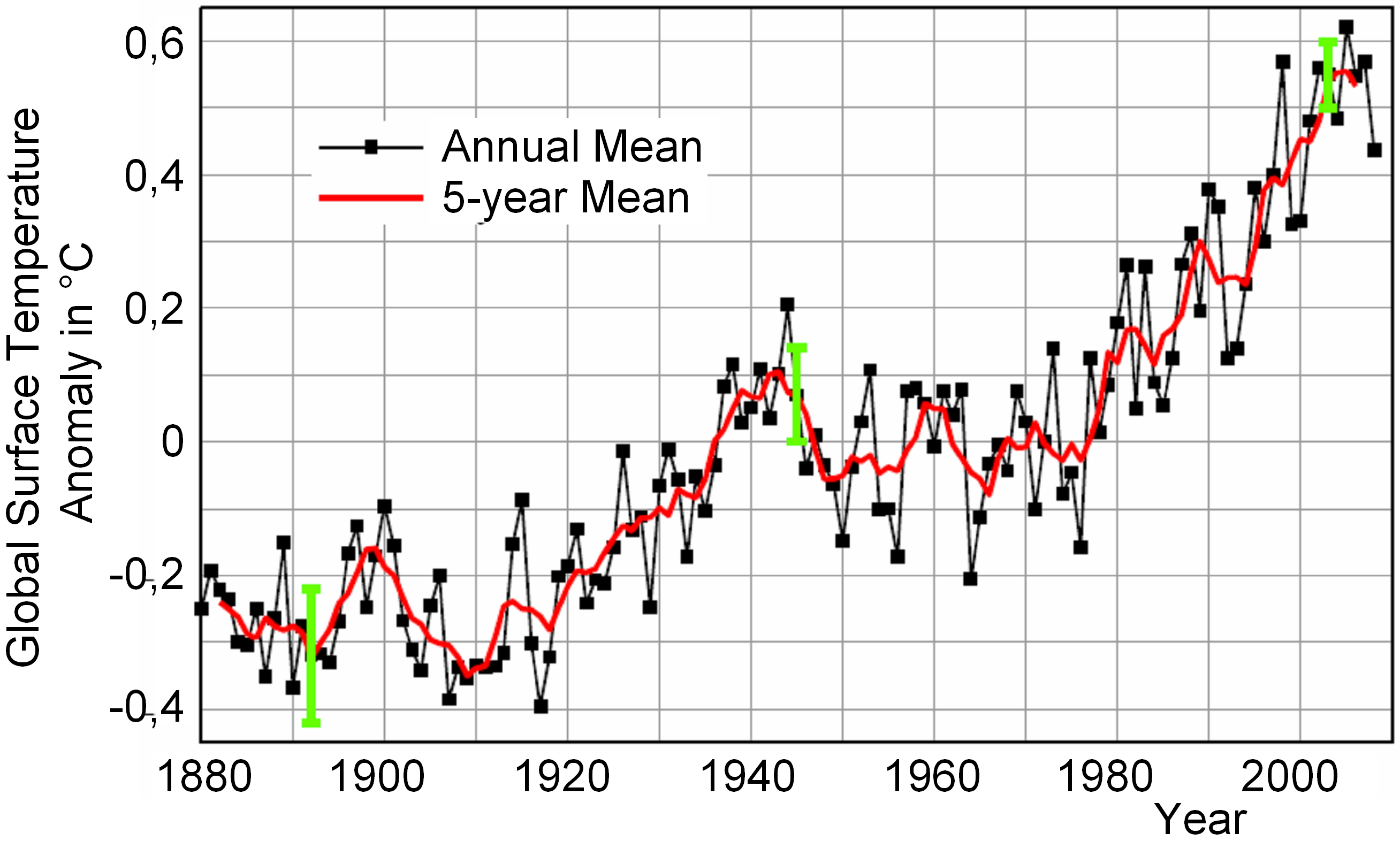
Global temperature anomaly at 10 m above land and ocean surface between 1880 and 2008, with
the mean temperature in the period of 1951-1980 as a reference (0°C temperature anomaly). |
The graph shown on the left above shows a time-series of monthly averaged atmospheric carbon dioxide concentrations on the northern hemisphere, measured from 1960 to 2007 at the Mauna Loa Observatory, Hawaii. Oscillations seen in the green and red curves are from seasonal variations of vegetation productivity. The black curve is a moving annual average where the seasonal fluctuations are no longer visible.
The graph on the right above shows the global temperature anomaly at 10 m above land and ocean surface between 1880 and 2008. The mean temperature in the period of 1951-1980 serves as a reference (0° temperature anomaly). Black dots represent mean temperatures in the respective year, the red line denotes a moving average over the annual temperatures. Green error bars denote the uncertainty of data. From 1951-1980 there was no remarkable trend in temperature increase. This was due to increasing atmospheric pollution with aerosols that reflected sunlight efficiently back to space, thus reducing the energy input at visible wavelengths. Later on, waste regulations have lead to a reduction of atmospheric pollution.
Scenario
Atmospheric carbon dioxide concentration and atmospheric temperatures near the ground appear to be closely related over the past 50 years. You are planning to predict the evolution of atmospheric temperature in the 21st century.
Questions
- What causes the fluctuations of the carbon dioxide curve (graph left above, green and red lines) around the moving average (black line)? Please check if these fluctuations have an annual periodicity.
- The carbon dioxide data were (and still are) measured at a station in Hawaii, i.e., on the northern hemisphere.
Would you expect a seasonal shift of the fluctuations when measured at a station on the southern hemisphere?
- Please take values of averaged carbon dioxide and temperature data from the graphs over the period of 1960-2005 at 5-years intervals and sketch
the data points of carbon dioxide versus temperature in a diagram. Is there an apparent linear trend of data points which can be approximated with a
best-fit straight line? Calculate a best-fit straight line using equations that you will find in the tutorial
Time Series Analysis, chapter 2, page 4.
Please calculate also the correlation coefficient using the equations given there; it describes in which quality the modelled best-fit line
represents the data points.
- Extrapolate the carbon dioxide curve over the time lapse of the 21st century. Extrapolate also your diagram of carbon dioxide versus temperature data up to the carbon dioxide concentration expected to exist by the end of the century. Which atmospheric temperature do you estimate? Find pros and cons for such extrapolations of trends.
Material needed
- Linear regression analysis, i.e. the calculation of best-fit lines and correlation coefficients, is presented in the SEOS tutorial Time Series Analysis, chapter 2, pages 4-6
- A detailed discussion of the Mauna Loa carbon dioxide curve is found in the SEOS tutorial on Time Series Analysis, chapter 2, page 7
- An animation of the seasonal evolution of carbon dioxide concentrations along with a satellite view of the global biosphere can be seen in the SEOS tutorial A World of Images
- Satellite data of the biosphere are also presented in the SEOS tutorial on Ocean Currents, chapter 4, page 1
Background Information
- NOAA Mauna Loa carbon dioxide time series and most recent data (scroll down both websites to find information)
- Goddard Institute for Space Studies (GISS) Surface Temperature Analysis
- Climate Change: Synthesis Report 2007 of the Intergovernmental Panel on Climate Change
