Temperature Trend in the Wadden Sea 2:
Linear Regression Analysis
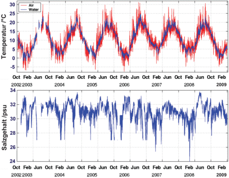
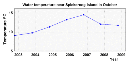
ScenarioWhile surfing in the internet, I found a series of measurements dealing with air and water temperatures including data on salinity taken at the North Sea coast of Spiekeroog. The diagrams on the right show the measurements that have been accumulated over several years. I also found mean values for each month. I downloaded the mean values and saved it here. They begin in October 2002 and last until March 2009. The columns indicate the year, the month of the year, air and water temperatures and the salinity of the water, all measured at Spiekeroog. Can we use these data to verify whether it's really getting warmer in the North Sea like they say in the news? Let's take a closer look. If there is a trend towards warmer temperatures, this would become visible by charting down the monthly mean values from October 2002 to March 2009 in a separate diagram. The trend should show an upwards curve. If the temperature increase is proportional to time, the diagram should show a curve going straight up. Recently I read in a newspaper that mostly the temperatures in autumn did show a strong trend to increase. So I plotted the October temperature data into a diagram. You will see the result here: |

Time series of air (red curve) and seawater temperature (blue curve) and seawater salinity measured from October 2002 until
March 2009. Salinity is given in psu which corresponds to the number of salt gramms per kilogramm of water. The marks on the
time axis indicate the 1st of April and the 1st of October of each year.
Not as easy as I thought... There are rising temperatures up to 2006, but then the temperature decreases again. ;-( How can we find the “correct” straight line that best shows the actual trend? It should be the line having the least distance to all points in the graph - which means that its difference to the actual measurements is smaller than that of all other straight lines plotted on the graph! The process of determining this particular straight line is known as linear regression or least squares fit, and the resulting straight line out of this process is called the best-fit line. |
Best-fit lines
Our search for a temperature trend in the North Sea is characterised by two features: temperature and time. This is not the case with other similar situations. The results of a dice game, for instance, show only one feature: the number of dots at every throw. In other cases, one feature is dependent upon another. The length of a coil spring would increase (one factor) as the weight hanging on its end increases (the other factor). The displacement of the coil is proportional to the weight; this is known as Hooke’s Law which you have probably encountered in your Mechanics lessons. The other word for proportionality is linearity. However, linear relationships between varying features are only valid under limited conditions: If you stretch the spring coil too far, it would loose its stretchability and ceases being linear.
The displacement of the coil and the weight hanging on it are correlated. Similarly, there is a certain correlation between the increasing temperatures that occured in the past 100 years: the correlation is brought about by the increasing amount of carbon dioxide in the atmosphere.
In some cases it is merely coincidental and not necessarily causal when two varying features appear to be correlated. For example: a scientific journal reports that the decreasing number of storks in the countryside is caused by the decreasing number of babies being born. Correlated or not?
There is actually no concrete proof that the temperature of the Wadden Sea grows linearly with time. If we examine a span of 100 years time, this may not apply. In shorter spans, however, we may be able to approximate a crooked curve by using a straight line (a tangent). We think this is applicable to temperature when observed over a span of several years only. This way, we can determine a best-fit line that can best depict the situation based on the data on the time axis and the annual mean values. The temperature data are more or scattered along this straight line. A measure that indicates how close the temperature data are to that particular line is the correlation coefficient.
Questions
Based on the mean monthly mean temperatures in the data file,
- please compute the centroid and the slope of the linear regression line of the October 2002 - 2008 water temperature data.
Draw a diagram showing the temperature data as points over the time axis, the centroid and the linear best fit line.
- please consider the October 2002 - 2006 data only, and sketch the resulting best-fit line into the same diagram.
- compute the correlation coefficients of the 2002 - 2008 and the 2002 - 2006 data sets, and discuss your findings.
- compare air and water temperature data for October 2002 - 2008. Draw a diagram of air versus water temperature,
and compute the best fit line and the correlation coefficient.
- compare water temperature and salinity data for October 2002 - 2008. Draw a diagram of water temperature versus salinity,
and compute the best fit line and the correlation coefficient, and discuss your findings.
Materials needed
- The worksheet as printable rtf-file
- Chapter 2 Working with Time Series
- Supplement 1: Point Clouds and Linear Regression Lines

