2. Working with Time Series
Mauna Loa atmospheric carbon dioxide time series (4/5)
Cyclic components
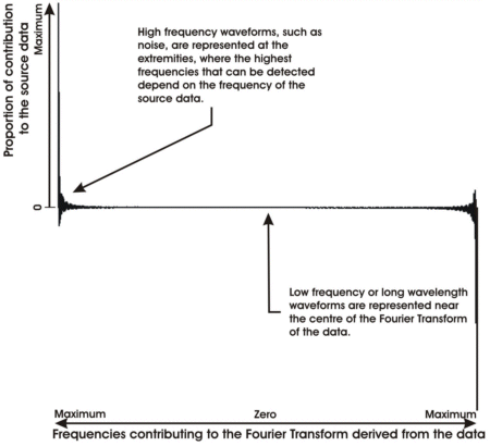
One way to analyse the frequency components in a time series like this is to convert the data into a graph showing the contributions of each frequency to the time series using the Fourier Transform.
The Fourier Transform assumes that a series can be represented by a set of cyclic functions, for example by a set of sine waves of different frequency. The Fourier Transform converts the dataset from the time domain into the frequency domain, showing which frequencies are present in the source data and their relative contribution to the source dataset.
We will do this using the so-called Discrete Fourier Transform, in which the amount of detail that we can extract from the data depends on the number of observations that we have and the frequency of those observations.
The values at the extremity show the contribution of the high frequency, which are much like noise in the data.
In our data there is a negligible contribution by the lower frequencies, since the signal is nearly flat in the central part of the graph. There will be little benefit from filtering the data.
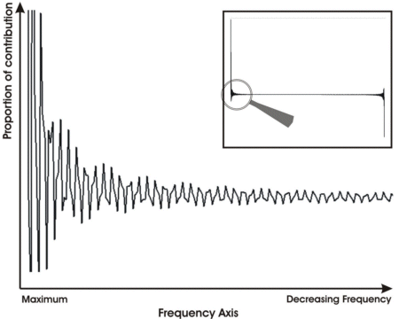
Let us magnify the end part of this graph to show what the graph actually looks like.
What happens if we get rid of the noise?


