2. Introduction into the Mathematical Methods
The multi-dimensional frequency distribution
So far we have just considered data in one dimension. What about data in a number of dimensions. How can we see this data?
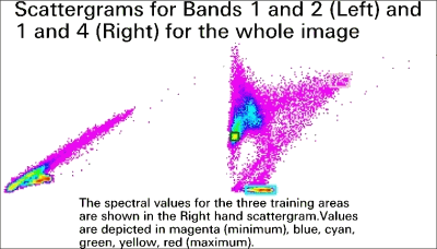
We can see two-dimensional data in a 2D frequency distribution.

Image source: USGS
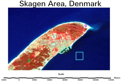
To create your own 2D frequency distributions or scattergrams, get the data in the skagensub.asc text file and import it into a spreadsheet. In this file the first two columns are the Easting and Northing location of the pixels. Each pixel is 20 metres × 20 metres in size, so you can locate where they are on a map. The other four values are the band values at that location. Plot each band against each other band. Two of the resulting 2D frequency distributions or scattergrams should look like those shown here.
You can see how larger values in band 1 will be matched by larger values in band 2 whilst larger values in Band 4 do not necessarily have larger values in Band 1. The data in Bands 1 and 2 are said to be co-related, or to use the statistical term, correlated. We will learn more about correlation in the next Lesson.
With four bands of data, you can plot a total of six scattergrams. Try this in the spreadsheet.
If you have n bands of data, how many scattergrams could you plot? The answer is:
If you have seven bands of data, do all of these scattergrams tell you all that you need to know about your data? Not really. You can create histograms of each band, and you can see that they do not tell you as much as the scattergram tells you about the relationship between two bands of data. In the same way, a scattergram depicting the relationship between two bands does not tell you all that there is to know about the relationships between all of the bands of data when there are three or more bands in the image data.
It is pretty difficult to perceive higher dimensional data, and so we are forced into using statistics derived from that data to tell us about how the data are related to each other. In the next lesson we discuss how to derive these statistics.
We learned:
Scattergrams show different structure for the training areas. It may be worth to go a bit more into the details, to find
a (semi-)automated method for classification.

